
If I had a dollar for every time I’ve heard “I want Hamptons Style” I’d be a very rich woman. But I’m not! And while it is my job to ensure my clients get what they want (it’s their house after all) I do also feel its important to help them inject a little of their personal style/personality and to explain how to not go too “full-on” with one specific style or theme. Of course, their space has to flow and be cohesive but there can also be too much of a good thing. Case in point, and also (hopefully) an inspirational example…
How to Merge Coastal Style With Industrial Style

Truly classic coastal is usually quite rustic with key elements being weathered, light colours and materials. It often verges on very classical and traditional with the light seaside vibe associated (and often confused) with true classic Hamptons style.

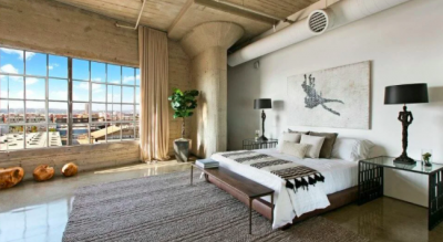
A combination of both coastal and industrial combines that lovely light and airy, rustic feel but it’s balanced with darker touches and cleaner/simpler lines. Definitely not as masculine and heavy as a true industrial, but somewhere in between. And it really does work!
Colour

Classic coastal style is based on predominantly white/light pale timbers, paired with light neutrals and blue and white accents – from duck-egg blue to French navy or even brighter blues. To combine coastal with industrial I like to darken the colour palette with touches of black. Think black steel legs on tables, black cane/rattan feature chairs etc. It picks up a lot of the darkness you see in an industrial design but also blends really well with all the traditional base colours – white, linen, beige and cream.
The result? It feels light and clean but with a stronger edge. It’s light but dark; monochromatic and neutral but white/pale isn’t the dominant timber base. Soft, stone greys and sandy tones dominate, layered with rusty, rich browns, classic cream, inky blues and the occasional pop of dark green for a truly balanced look.
Texture

An industrial edge comes from rougher textures combined with darker colours to balance out the smoother materials like simple white plaster walls, concrete floors and smooth metal accents.
I always like to warm up a lovely blank/white canvas with the addition of lots of texture. Or sometimes simply by adding pops of your signature colour. Add handmade pieces – old photos and books, earthy ceramics in light tones, framed photos or artwork painted by the kids, plants or flowers – anything that looks and feels like it has a history, or simply tells your story.
So what are the key elements for pulling off Coastal Industrial?

- Think touches of black, charcoal grey, tan, and dark blue or green added to a predominantly light neutral theme of beige, white, sand, linen
- Bring in touches of black, streamlined metal to combine with lighter, weathered or recycled wood
- Warm things up with wicker or rattan, personal or handmade objects, books, photos
- Soften the look with touchable textures – linens, soft but chunky knitted throws, fringing or tassels
- Keep pattern to a minimum. A pop of colour and texture will usually create enough interest.
- Keep it personal! Include homewares that tell your story. Family photos, home-made items, books you actually DO love to read…you get the picture?! 🙂
And don’t forget how easy it is to add those personal touches to your coffee table vignette! I wrote another blog about that recently. You can read it here…


